Expert-Curated Colour Combinations for Beautiful Home Interiors
Choosing paint colours for your house is more than a simple aesthetic decision; it’s an act of curation that defines the mood and character of your living space. Selecting the best colour combination for house interiors helps create balance, comfort, and visual harmony in every room. With the global interior design market projected to exceed over the coming years, the value of a well-executed design has never been clearer. This guide moves beyond fleeting trends to explore expert-curated colour combinations that bring timeless beauty and harmony to any interior.
The Challenge of Colour Selection for Home Interiors
The sheer volume of available shades and tones can be overwhelming. Homeowners often face a paralyzing number of choices, leading to safe but uninspired palettes or, conversely, combinations that feel disjointed. Creating good colour combinations for home interiors means ensuring that wall colours, furniture colour combinations, and decor work together seamlessly. The goal is to build a cohesive flow across rooms while still allowing each space to have its own identity.
What Defines “Expert-Curated” and Why It Matters
An expert-curated colour palette is not just a random mix of attractive shades. It is a thoughtful selection based on colour theory, psychology, and balance. This careful approach helps identify the best colour combination for house interiors by considering how different colours react to light, space, and each other. When done right, it creates a specific mood and ensures your home looks sophisticated, well-planned, and visually harmonious.
The Expert’s Lens: Foundations for Sophisticated Colour Choice
Before diving into specific palettes, understanding a few core concepts is essential for making informed decisions. These principles form the base of successful home decor colour combinations.
Demystifying Colour Psychology: Setting the Mood
Every colour combination evokes an emotional response. Cool tones like blue and green often create a sense of calm, while warm shades of yellow and orange can energize a room. These associations have a real-world impact; contemporary colours like navy blue can positively influence a buyer’s perception of an entire home. Choosing aesthetic colours for room interiors based on how you want the space to feel helps create homes that are not just beautiful but emotionally comforting too.
Mastering Neutrals: The Canvas for Enduring Elegance
Neutrals are the unsung heroes of interior design. A palette built on sophisticated shades of white, beige, and grey provides a versatile and timeless foundation. The key is to pay attention to undertones. A warm, creamy white feels inviting, while a cool, crisp white lends a modern edge. Layering different neutral tones adds depth and prevents the space from feeling flat.
The Art of Balance: Dominant, Secondary, and Accent Colors
A balanced colour scheme typically follows the 60-30-10 rule. Your dominant colour (often a neutral) should cover about 60% of the space (walls), the secondary colour takes up 30% (furniture, curtains), and a bold accent colour makes up the final 10% (cushions, art, accessories). This is where highlight wall design becomes effective, adding visual interest without overwhelming the room. A single accent wall or bold artwork can instantly transform a space.
Expert-Curated Palettes for Beautiful Home Interiors
Here are five expertly crafted colour palettes designed to inspire and elevate your home.
Serene Sanctuary: Ocean Blue & Sandy Beige
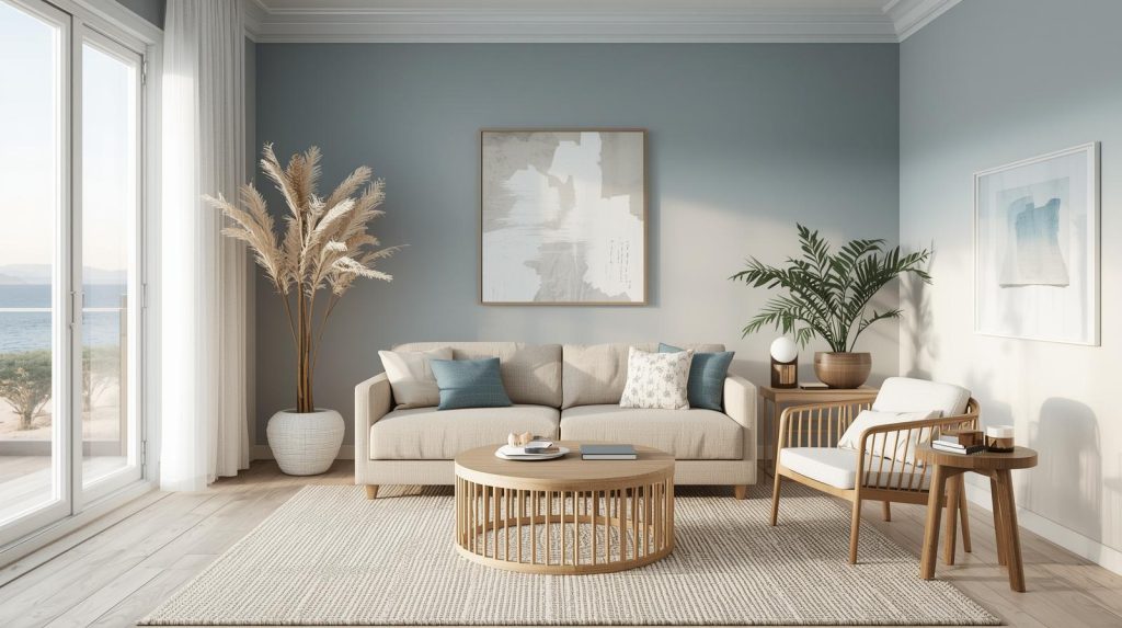
This classic pairing is often considered one of the best colour combination for house interiors, especially if you love a calm and relaxed vibe. Ocean blue and sandy beige bring a soothing, coastal feel to any room. Use soft sandy beige as the main wall colour, and add different shades of blue through cushions, curtains, rugs, or wall art. The result is a light, airy space that feels peaceful and welcoming, almost like a personal retreat at home.
Earthy Elegance: Sage Green & Warm Greys
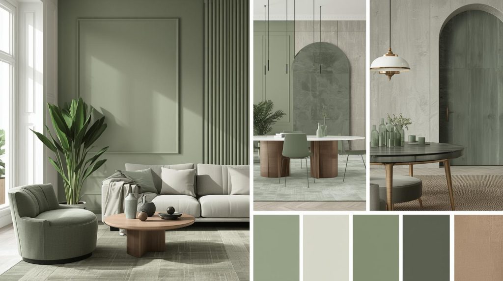
For a grounded and organic atmosphere, pair muted sage green with warm-toned greys. This palette connects the interior with the natural world, promoting tranquility. It works beautifully in bedrooms and living areas, creating a space that feels both sophisticated and restorative.
Bold & Beautiful: Sunset Coral & Deep Teal
To make a confident statement, combine the vibrant energy of sunset coral with the rich depth of deep teal. This high-contrast pairing is perfect for creating a focal point. Use teal on an accent wall or a statement piece of furniture, and introduce coral through smaller decorative elements for a burst of warmth and personality.
Timeless Sophistication: Cacao & Soft Pinks
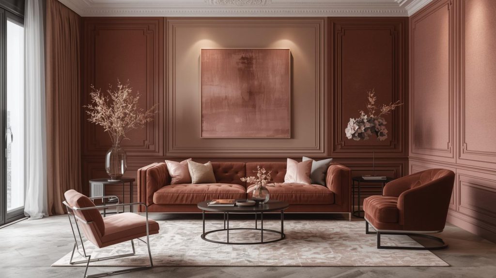
Rich cacao brown paired with dusty or soft pinks creates a palette that is both warm and incredibly chic. This sophisticated combination feels luxurious and inviting. Use cacao for grounding elements like flooring or furniture, while soft pink tones can soften the space on walls or through plush textiles.
Modern Contrast: Sapphire & Bright Citrine Orange
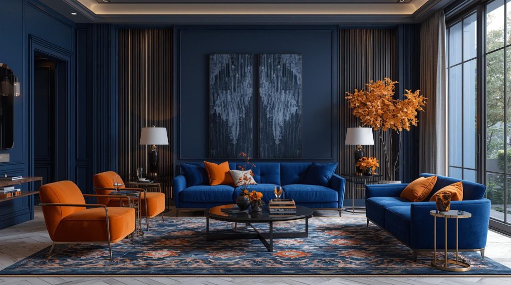
If you love bold and modern interiors, this is one of the best colour combination for house designs that makes a strong statement. Deep sapphire blue adds depth and elegance, while bright citrine orange brings energy and warmth to the space. Use sapphire on feature walls or larger surfaces, then add pops of orange through cushions, artwork, or décor pieces. This contrast creates a lively, stylish look that feels fresh, confident, and full of personality.
The Expert’s Toolkit: Bringing Your Curated Palette to Life
With a chosen color palette, the final step is a thoughtful application.
Visualizing Your Vision: The Importance of Samples & Swatches
Never commit to paint colours based on a small chip. Always test large swatches on your walls to see how they look in your home’s unique lighting throughout the day. This crucial step prevents costly mistakes and ensures you love the final result.
Beyond the Walls: Integrating Furniture, Textures, and Patterns
Your colour scheme extends beyond paint. Integrate your chosen palette into furniture, rugs, and decor. Use different textures like velvet, linen, and wood to add another layer of depth and interest to your design.
Considering Architecture, Lighting, and Flow
Consider how your colour palette will connect adjacent rooms to create a cohesive house-wide scheme. Pay attention to how natural and artificial light interacts with your chosen shades, as it can dramatically alter their appearance. Lighting can change how colours appear, and testing helps ensure your chosen colour palette for interiors works well throughout the day.
When to Seek Professional Guidance
If you feel uncertain, consulting an interior designer like Fabdec Interiors can be really helpful. We can help refine your palette, source materials, and ensure the final design is executed flawlessly, just as you needed in your mind.
Conclusion: Your Beautiful, Expert-Curated Home Awaits
Choosing a colour palette is one of the most transformative decisions you can make for your home. By moving beyond single shades and embracing curated combinations, you create a space that feels harmonious, intentional, and emotionally welcoming. A thoughtfully planned scheme using the best colour combination for house interiors can elevate your space from simply decorated to truly well designed.
Armed with an understanding of colour psychology, balance, and a few expert-vetted palettes, you now have the tools to make confident choices on the best colour combinations for home. Trust your instincts and use these guidelines to create a space you love. Ultimately, the best colour palette is one that reflects your personal style and enhances your daily life. Use these expert insights as a springboard to design a beautiful, cohesive, and deeply personal home.